FINN Jobb / Easy apply
FINN.no is Norway’s largest online marketplace, connecting users with everything from real estate to vehicles to job opportunities. Easy Apply or "Enkel søknad" as it's called in norwegian, is a product within FINN Job that allows users to apply directly on the platform without being redirected to an external link where they sometimes need to create unnecessary logins or repeatedly input their CV and application letter.
In this project we aimed to meet the objective: "Nail product-market fit between our product and white collar segment". My role focused on assessing the effectiveness of this new approach and improving Easy Apply’s visibility on the job object page.
Challenge & Hypothesis
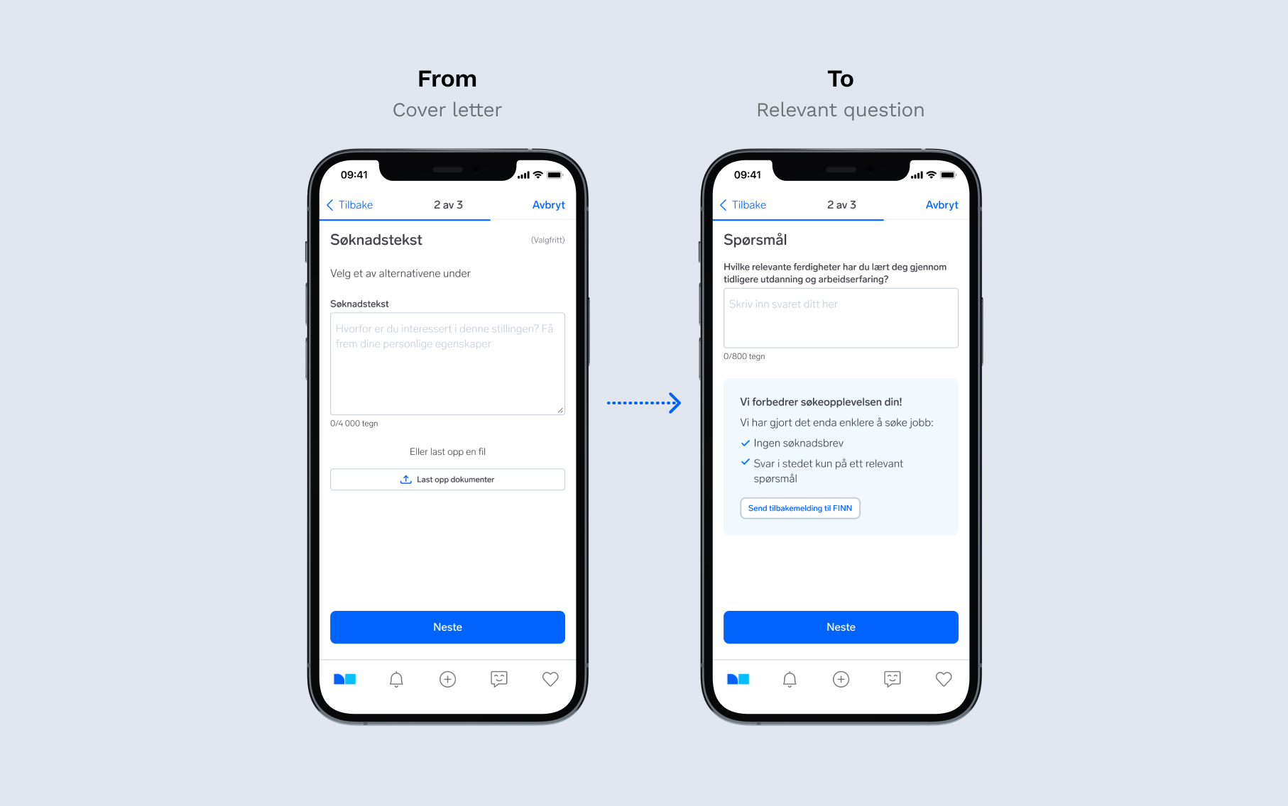
Previous insights and data revealed that our hard-to-hire segment consists largely of passive candidates. We aimed to address this challenge by lowering the application threshold by replacing the application letter with a single question about previous relevant experiences. Our hypothesis was that this format would encourage more white-collar professionals to apply.
Our high level goals were to:
- Make it easier for our white-collar candidates to apply for a job.
- Increase the pool of relevant candidates for our recruiters.
Beautify (concept)
Fictive hairdresser app to help you find hairdressers/barbers around you for a fast and spontaneous haircut or treatment.
Brief Design wireframes and design for an iOS app
Role UX/UI design – Animation
Year 2018
Role
Product Designer
Platform
Web
App (iOS/Android)
Tools
Figma
Google Meet
Hotjar
Miro
Year
2024
Beautify (concept)
Fictive hairdresser app to help you find hairdressers/barbers around you for a fast and spontaneous haircut or treatment.
Brief Design wireframes and design for an iOS app
Role UX/UI design – Animation
Year 2018
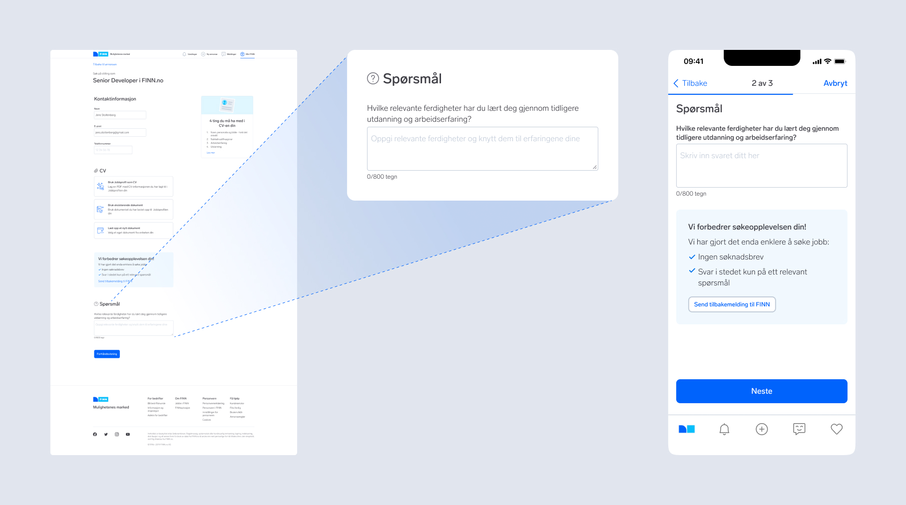
"What relevant skills have you learned through previous education and work experience?"
Building on previous insights
This project was a continuation of an earlier experiment that had uncovered valuable insights: through user test's and interviews with white-collar candidates, we learned among other things, that writing the application letter was consistently seen as the most time-consuming and stressful part of the application process. With this knowledge, the team decided to take a bold step forward by replacing the traditional application letter with a single, targeted question:
"What relevant skills have you gained through previous education and work experience?"
With this question and the 800-character limit, we hoped to invite a diverse range of candidates to apply quickly and easily while still capturing the essence of their experience and qualifications.
Research approach
My role in this phase was to determine whether this new approach would resonate with our target audience, and to make sure Easy Apply caught the eye of potential applicants on the ad object page. Through our partner Norstat, we were able to connect with users from our specific target group based on the following criteria:
- White collar segment
- Age between 25–55
- Currently employed
Actively searching for a job/have done so in recent months
We had originally booked 8 users for interviews and user testing, but only managed to get a hold of 6. Reflecting Schibsted’s core value to "Move fast" we decided that 6 users would be sufficient for this pilot to maintain momentum and gather insights quickly.
The user interviews were conducted remotely using Google Meet, as FINN's users are based in Norway 🇳🇴 while I am located in Sweden 🇸🇪.
The participants included:
- 3 women and 3 men
Geographically distributed across cities such as Oslo, Bergen, Lillehammer, and others

Insights
As we talked to participants, it became clear that the simplified application process was well-received overall, with many noting that it saved time and reduced stress. Answering a single, relevant question allowed them to apply for jobs quicker, especially for roles where they already felt qualified. However, some participants raised concerns about the format’s limitations, particularly around its ability to help them stand out or adequately showcase their skills and experiences.
Positive insights from the interviews:
Easier to apply for a job with just one question
- Less time consuming
Negative insights from the interviews:
- Still feels like writing an application letter
The 800-character limit isn’t enough to detail past experiences
Harder to stand out with just answering one question
- More people may apply for the same positions, increasing competition
Could make it more difficult for companies to find the right candidates
Obserations:
Some users wanted the ability to include personal qualities or other relevant experiences
Multiple questions could work better than a single application letter

Hotjar feedback
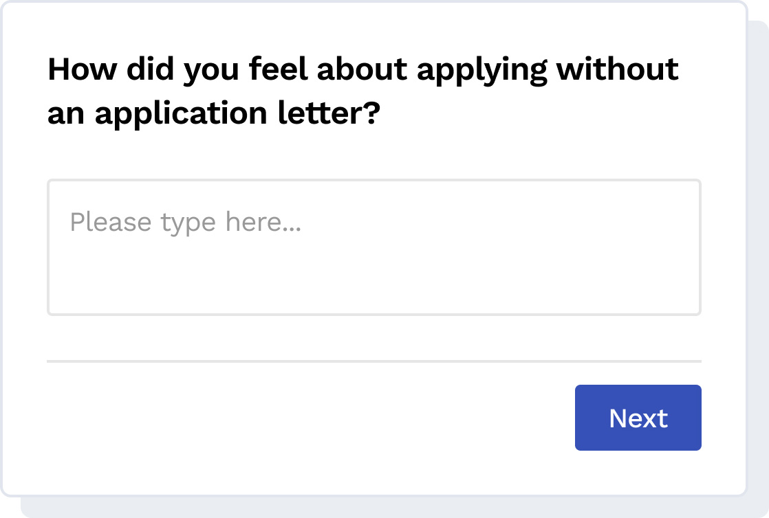
To gather additional feedback, we implemented a Hotjar survey in the confirmation step of the Easy Apply flow. This allowed us to collect quantitative data on user satisfaction and insights about their experience applying without an application letter.

We were pleasantly surprised by these positive results, which proved that our idea was worth testing. Additionally, the survey generated many valuable comments—some aligned with feedback gathered during the interviews, while others added new reflections that provided deeper insights into the user experience.

Conclusion
The Easy Apply pilot demonstrated that simplifying the application process could effectively lower barriers for candidates while increasing engagement. The positive feedback from both the interviews and the Hotjar survey validated the approach, showing that the single-question format made the process easier and more approachable.
However, with the insights we gathered the team concluded that this wasn’t fully the solution to our problem. While the pilot successfully reduced the threshold, candidates still needed to do the one thing we knew was the most stressful and time-consuming part of the application process—write. This limitation also made us question whether the solution would meaningfully increase the number of professionals applying for white-collar roles.
As a team, we decided that we needed to take a step back and be even bolder! Could we remove the application letter completely? And with that, a new idea was born—one we began to pursue...
Improving Easy Apply visibility on the ad object page
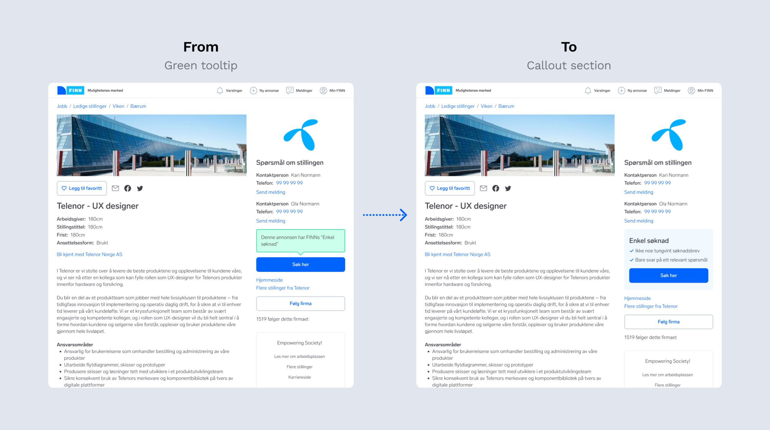
Since joining the team, I noticed that Easy Apply had been represented by a green tooltip on the ad object page stating, "This ad has FINN's Easy Apply." While functional initially we observed that this tooltip no longer attracted users effectively. From a UX standpoint, it had lost its informational value and needed to be updated to better serve candidates.
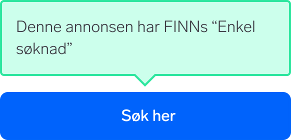
To address this we iterated on multiple design versions with the following objectives:
- Inform candidates the ad features Easy Apply.
- Inform no need for a traditional application letter.
- Inform candidates they only need to answer one question.
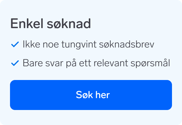
We conducted a design test using a simple Figma prototype of the new Easy Apply box to evaluate its potential impact. Four out of six users said the updated copy influenced them to click the apply button. However, the feedback on the copy was mixed—some users found it intriguing, with comments like “Interesting! Curious to what the one relevant question is", while others were more skeptical. Unfortunately, due to technical challenges and dependencies, the new design could not be fully implemented and tested at the time.
